BUG HUB

Brand Identity
BRIEF:
This project was done for Brand Identity class under the supervision of Richard Rose. We were each given our own random museum to redesign; mine was a bug museum located in New Jersey, called Insectropolis.
CHALLENGES:
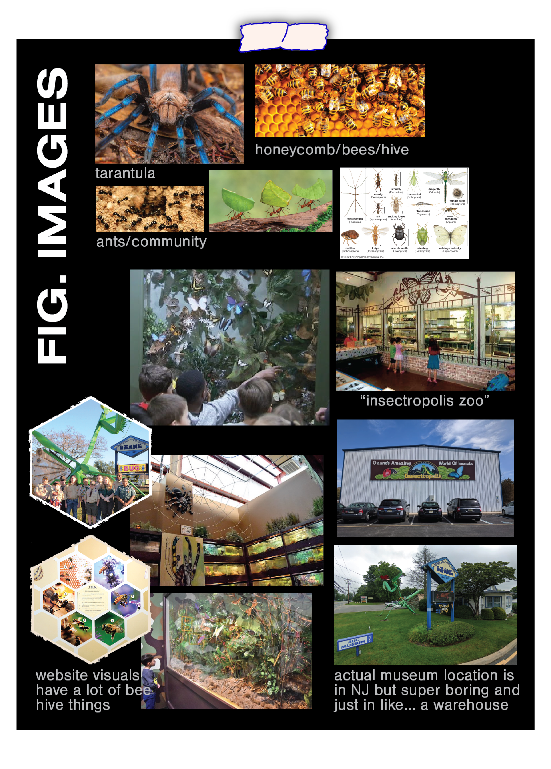
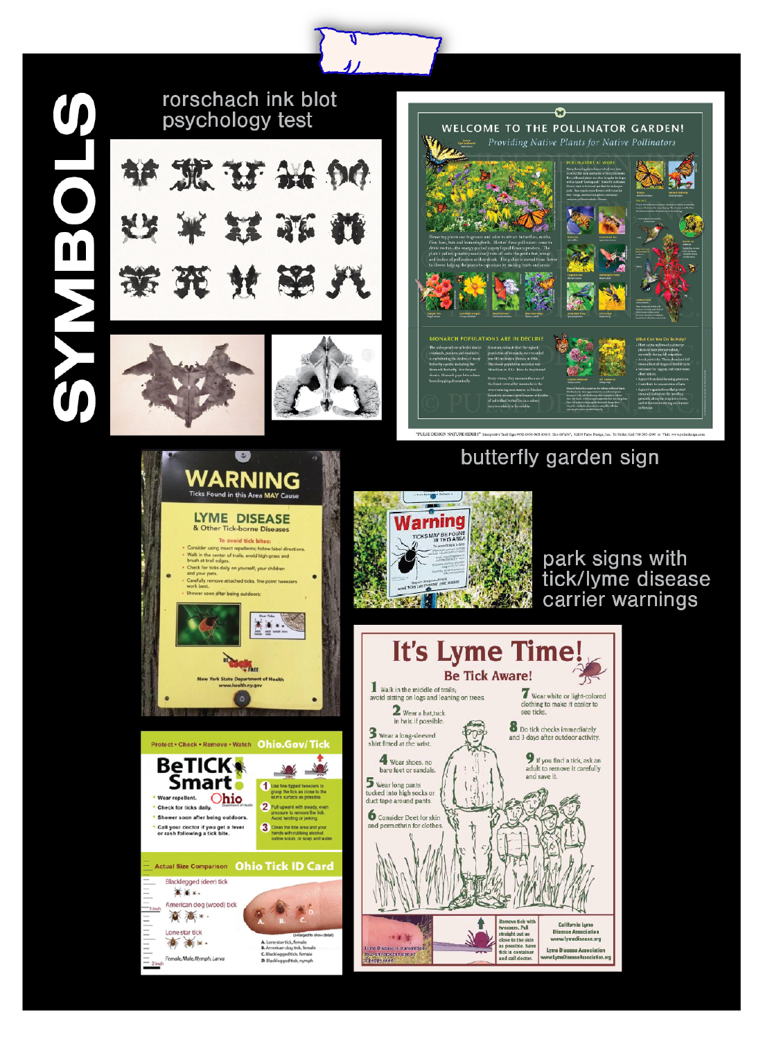
This was a very uninteresting kid’s museum located in the middle of nowhere, New Jersey. As a kid, I never liked science, and definitely not anything related to insects. My goal was to make this redesign look more interesting, pretty, and inviting. The challenge was to steer away from the idea of insects being so creepy/crawly.
SOLUTION:
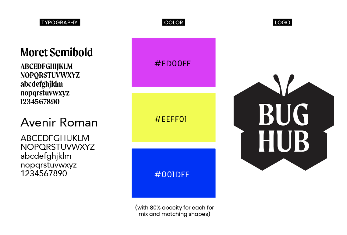
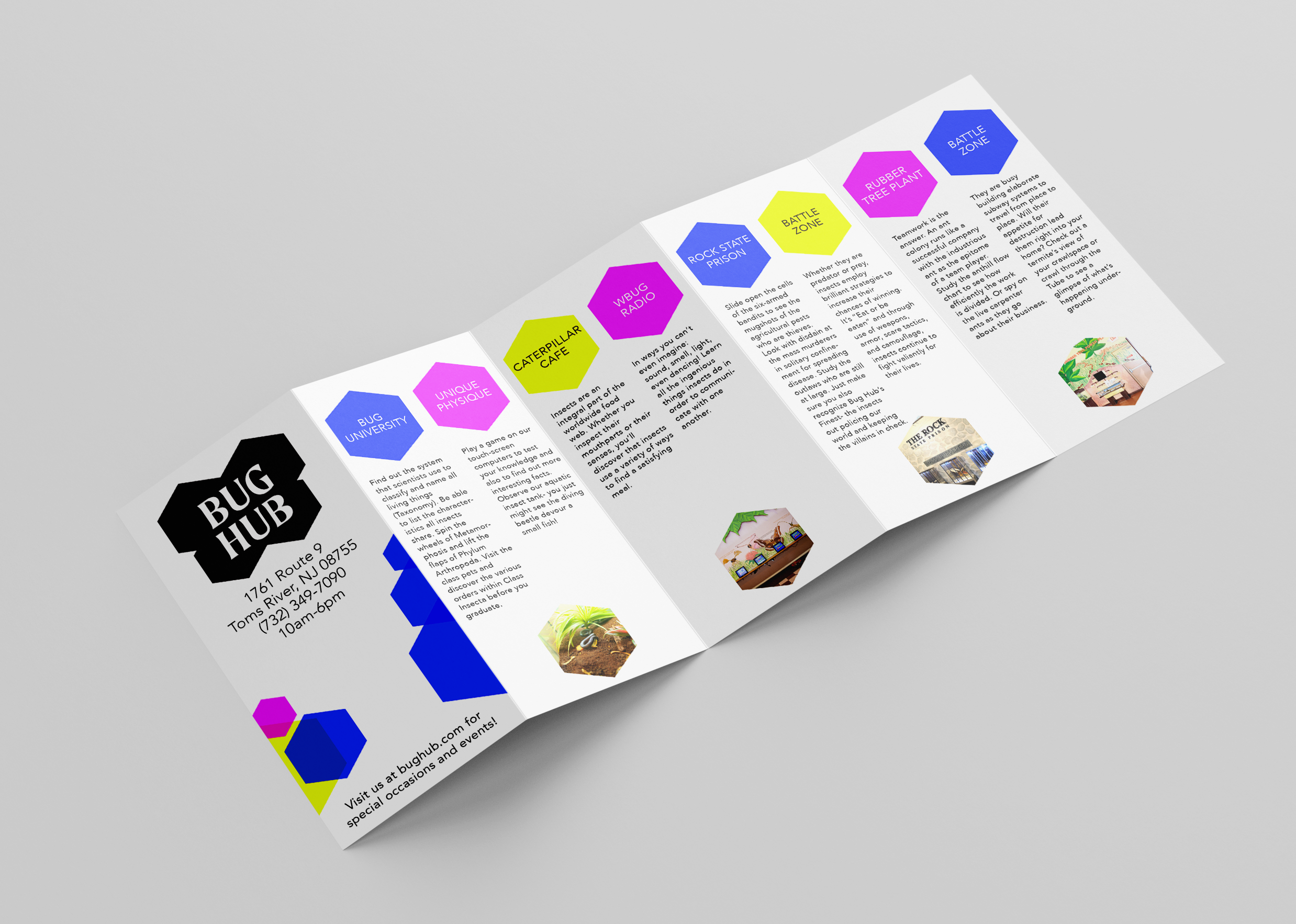
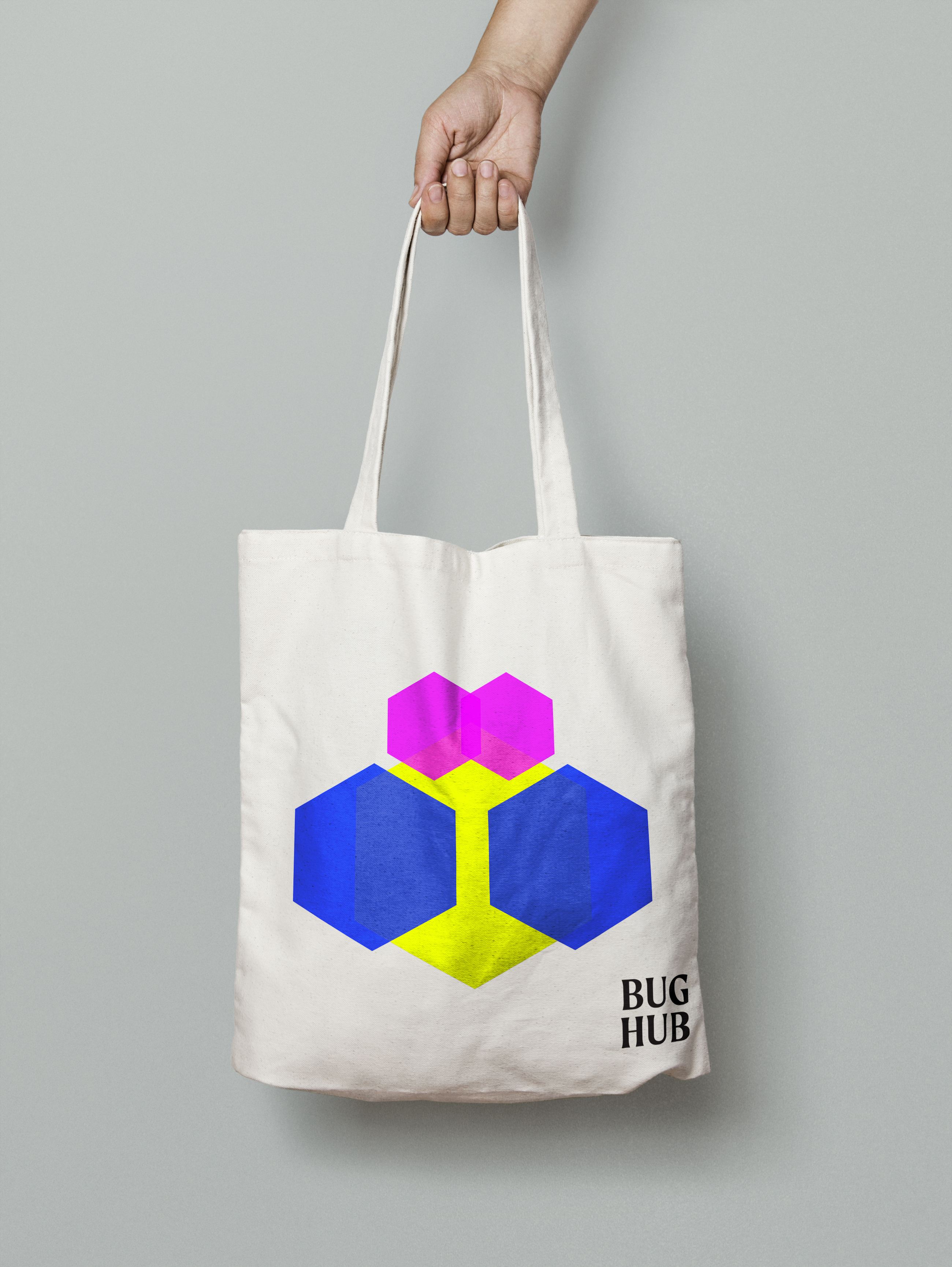
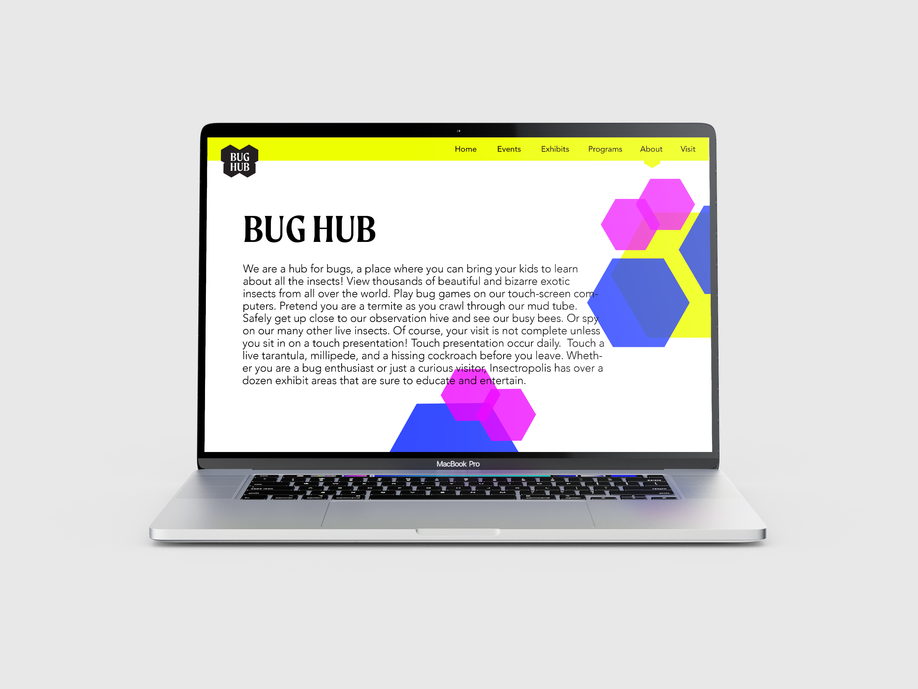
After collecting images and doing research, I learned that all bugs have symmetry, which is where the idea of the logo came from; creating a butterfly with the shape of honeycombs. The colors were inspired from the bright colors of different kinds of beetles.
BRIEF:
This project was done for Brand Identity class under the supervision of Richard Rose. We were each given our own random museum to redesign; mine was a bug museum located in New Jersey, called Insectropolis.
CHALLENGES:
This was a very uninteresting kid’s museum located in the middle of nowhere, New Jersey. As a kid, I never liked science, and definitely not anything related to insects. My goal was to make this redesign look more interesting, pretty, and inviting. The challenge was to steer away from the idea of insects being so creepy/crawly.
SOLUTION:
After collecting images and doing research, I learned that all bugs have symmetry, which is where the idea of the logo came from; creating a butterfly with the shape of honeycombs. The colors were inspired from the bright colors of different kinds of beetles.
ENGAGEMENT PIECE:
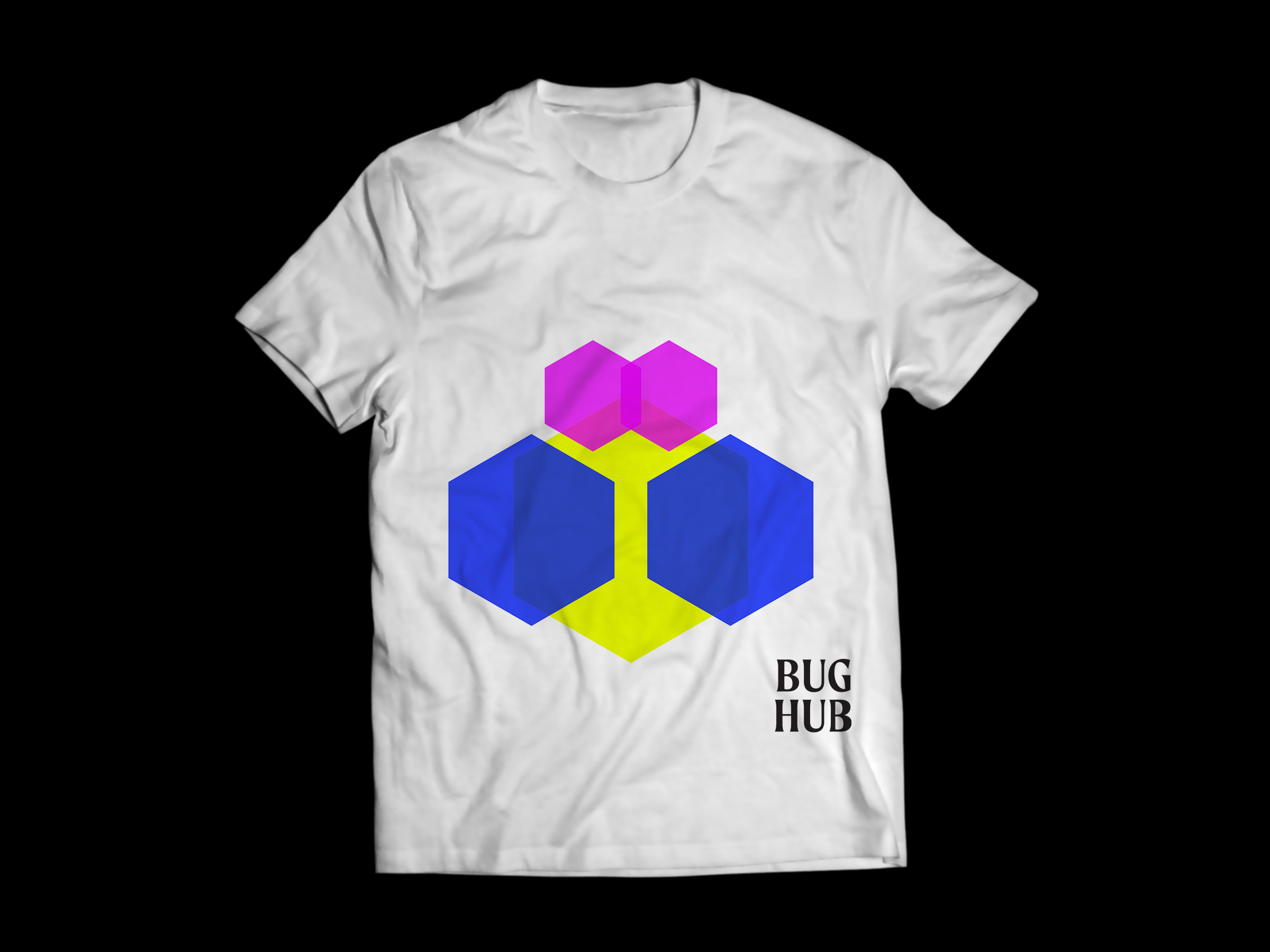
 For my engagement piece, kids will get a trading card for every visit at the museum. Each card will have a different bug pattern with the hexagonal shapes. When they collect their 6th one, they can make their own bug from the shapes by coloring in the hexagons.
Museum Applications:


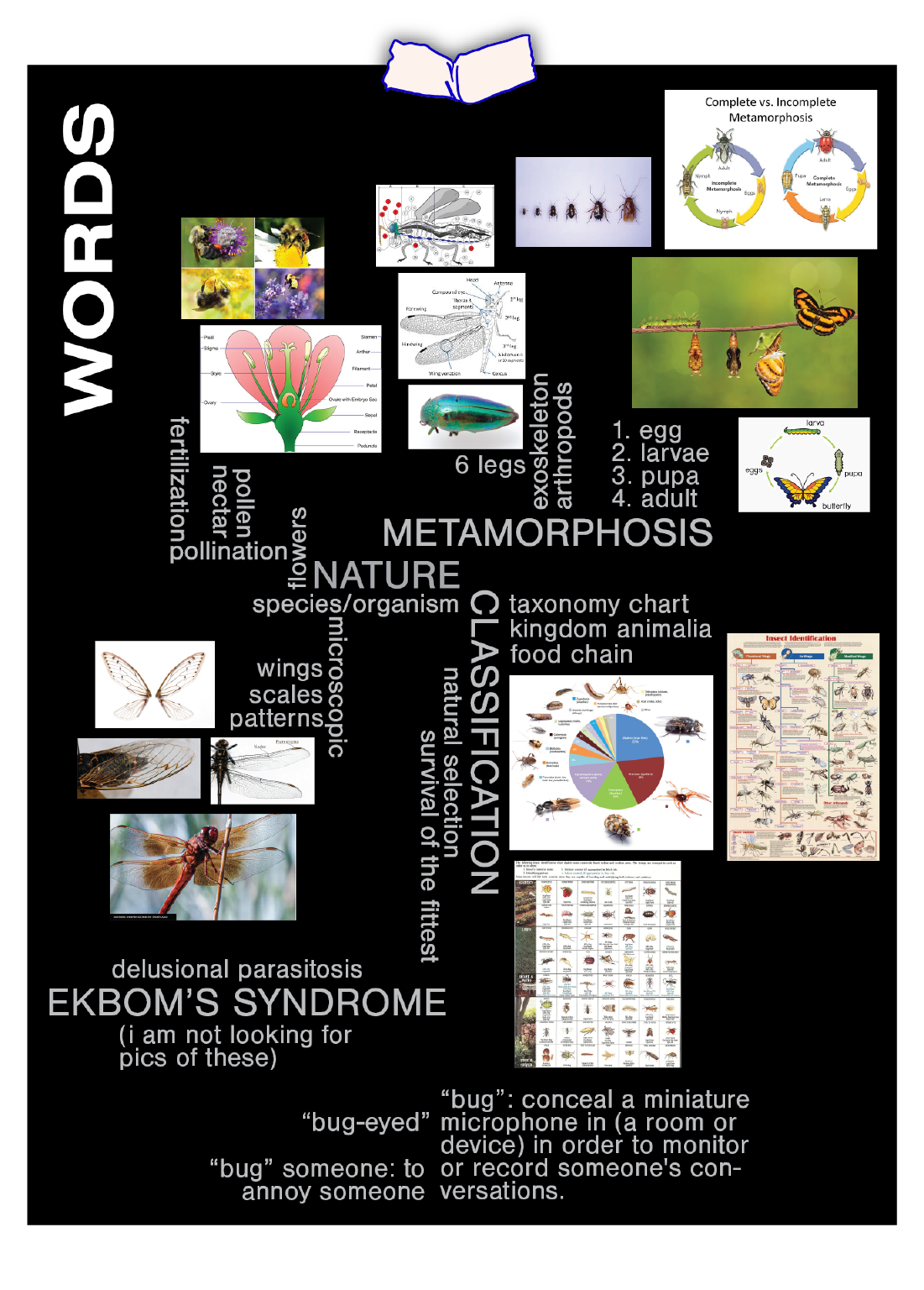
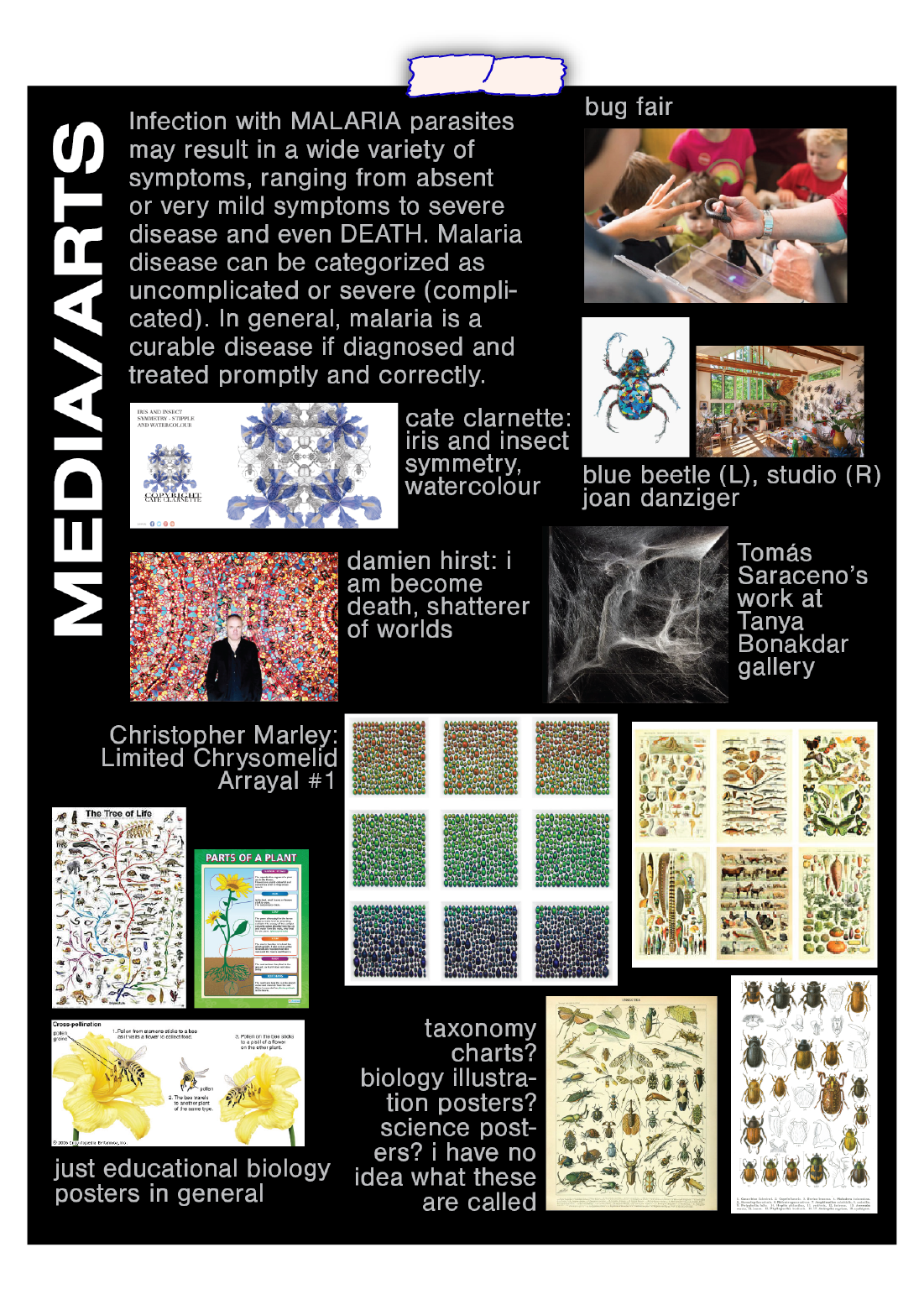
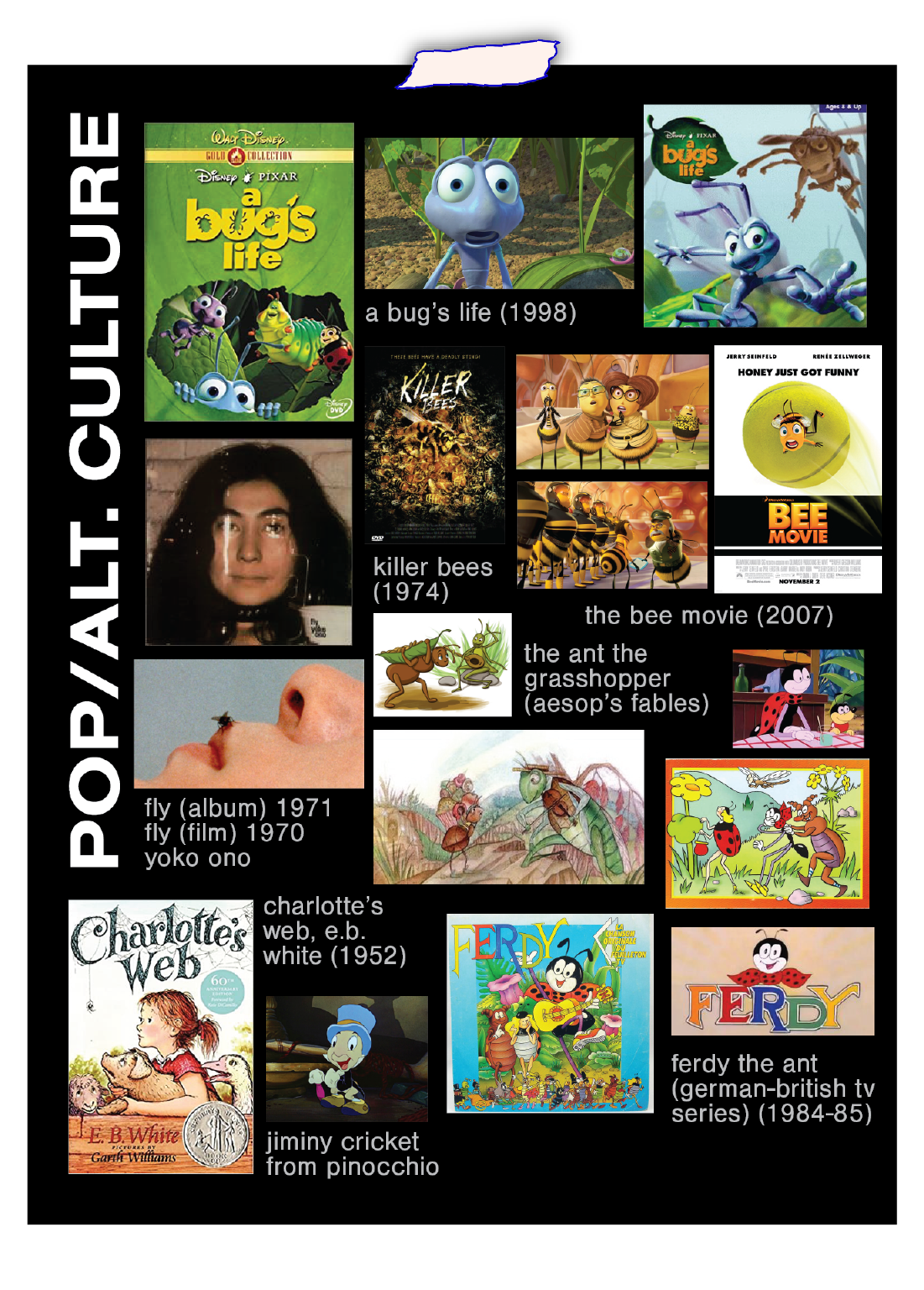
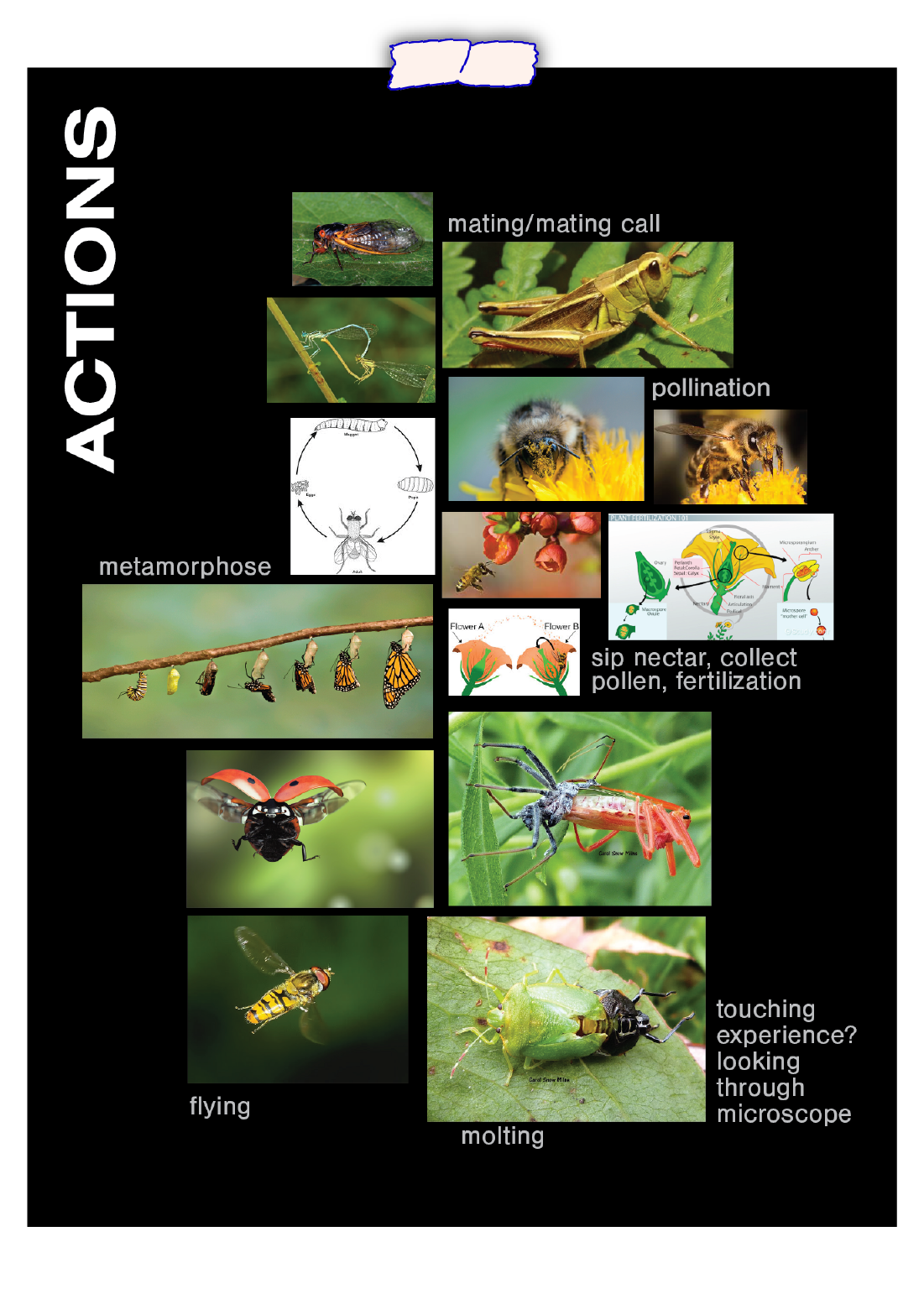
Moodboard: