Rhode Island Music Festival

Brand Identity
BRIEF:
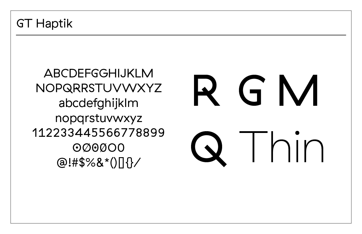
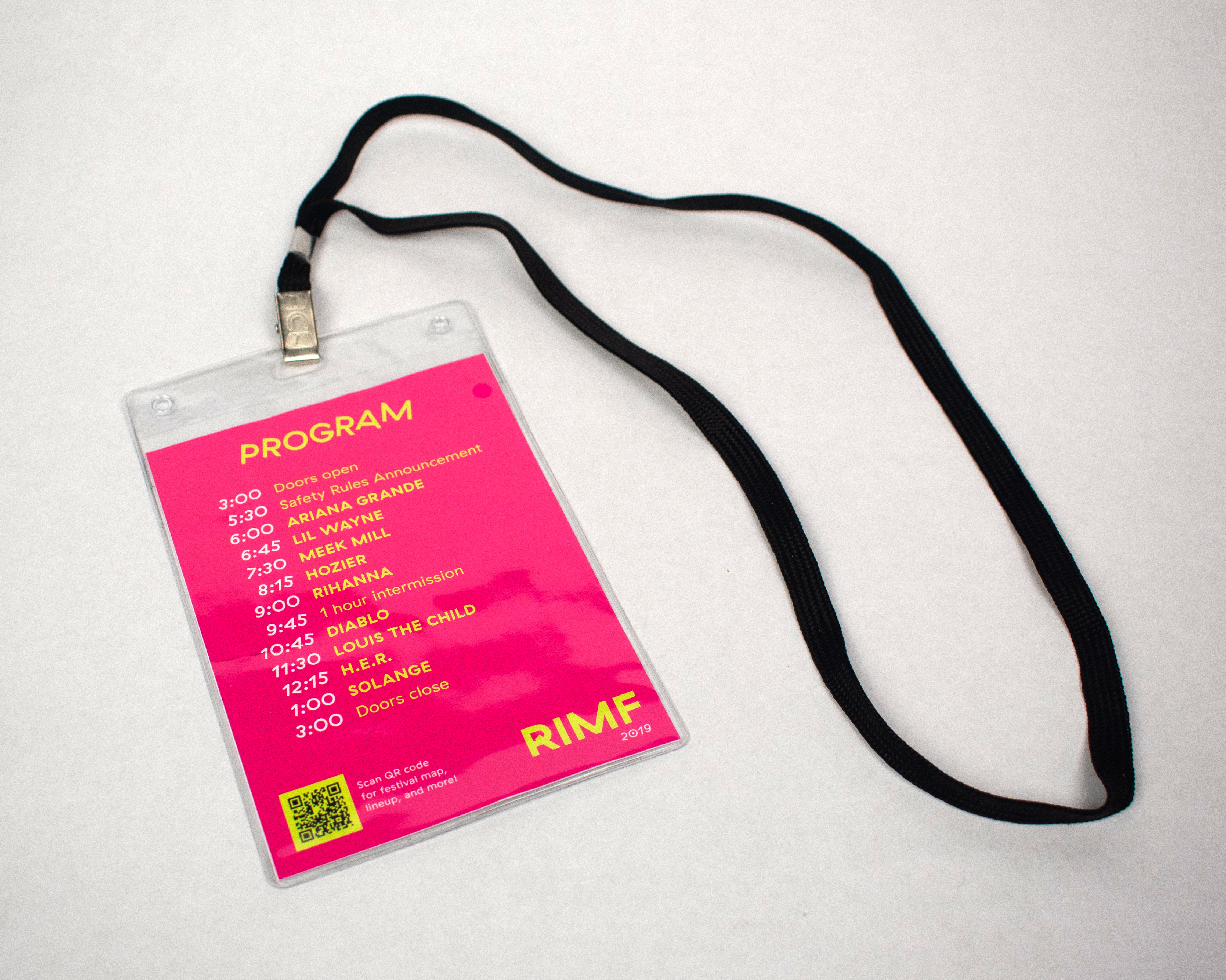
This project was done for Typography II class under the supervision of June Shin. This project was called “REVERSE,” where we picked a typeface and studied it, and then created an event. The typeface that I chose was GT Haptik and created a festival called the Rhode Island Music Festival. The festival would be taken place at night, full of neon lights. The identity is dispersed into different forms: mobile, merchandise, a ticket pass, and a brochure, which also functions as a map and poster.
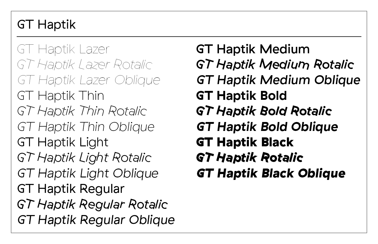
The motivation for this festival was coming from the typeface and how fun the rotalic versions were. It reminded me a lot about music, hence the creation of a music festival, with the primary colors of a bright neon pink, a yellow-green, black, and white.
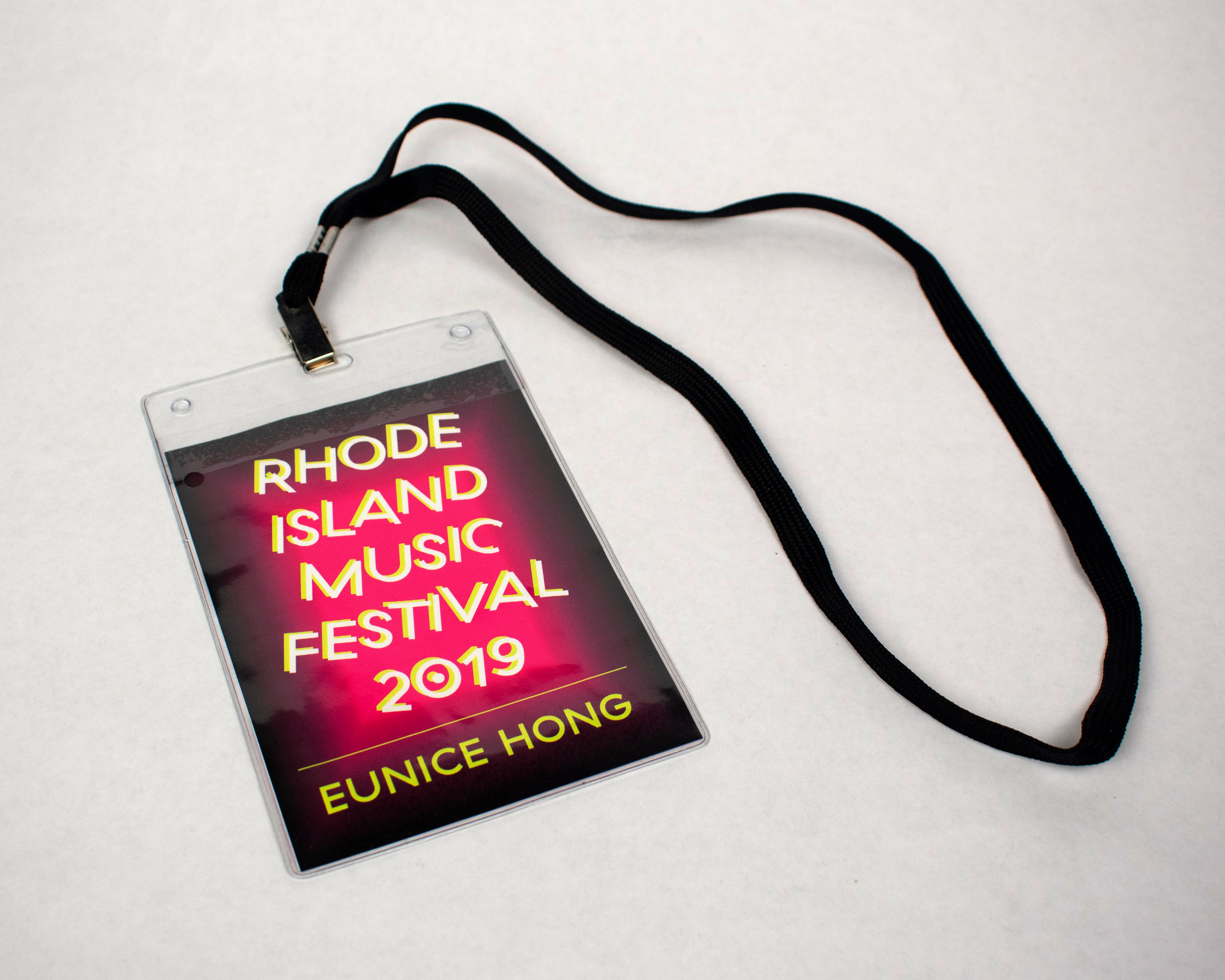
BRIEF:
This project was done for Typography II class under the supervision of June Shin. This project was called “REVERSE,” where we picked a typeface and studied it, and then created an event. The typeface that I chose was GT Haptik and created a festival called the Rhode Island Music Festival. The festival would be taken place at night, full of neon lights. The identity is dispersed into different forms: mobile, merchandise, a ticket pass, and a brochure, which also functions as a map and poster.
The motivation for this festival was coming from the typeface and how fun the rotalic versions were. It reminded me a lot about music, hence the creation of a music festival, with the primary colors of a bright neon pink, a yellow-green, black, and white.